LLH Massage


LOGO DESIGN

BRAND BUILDING

WEBSITE DESIGN

SOCIAL MEDIA MARKETING

Case Study


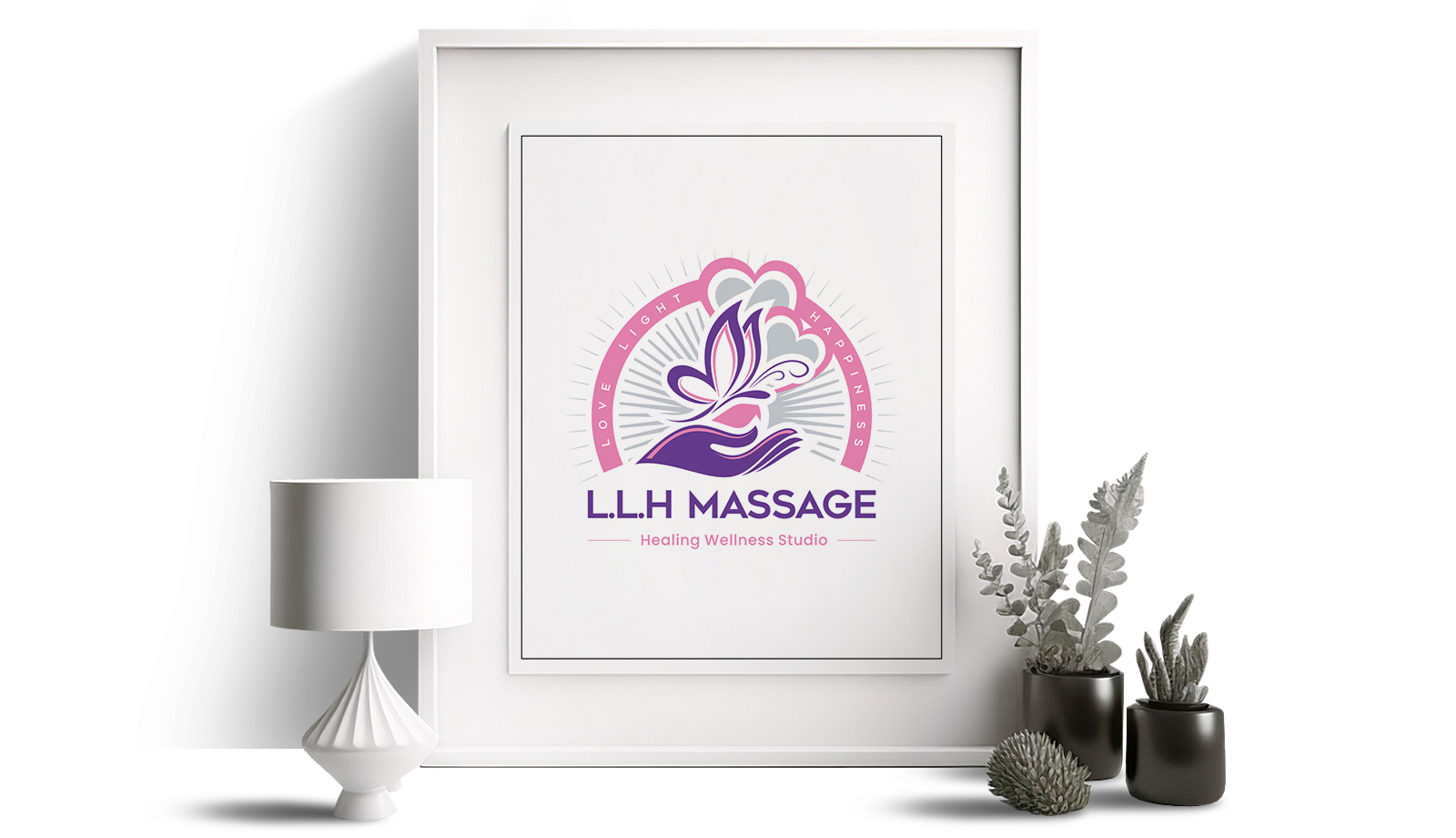
LLH Massage emerged as a fresh entrepreneurial venture by a team of massage therapists aiming to infuse their fundamental values of love, light, and happiness into the realm of massage, emphasizing healing and personalized care. This thriving and varied initiative quickly struck a chord with a broad clientele, thanks to targeted online and promotional campaigns, which included mobile massage services, bespoke massage products, and branded giveaways.

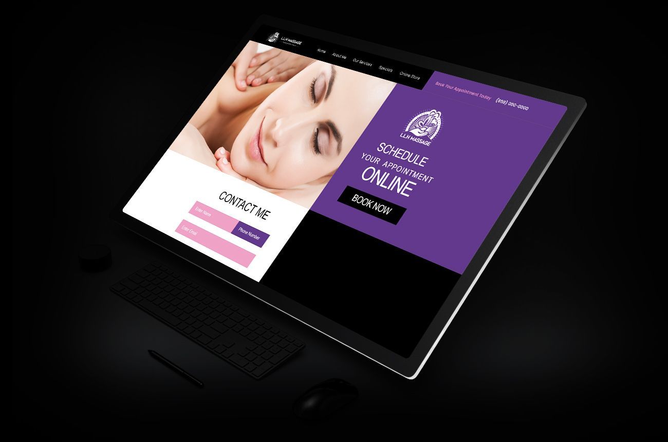
Hero

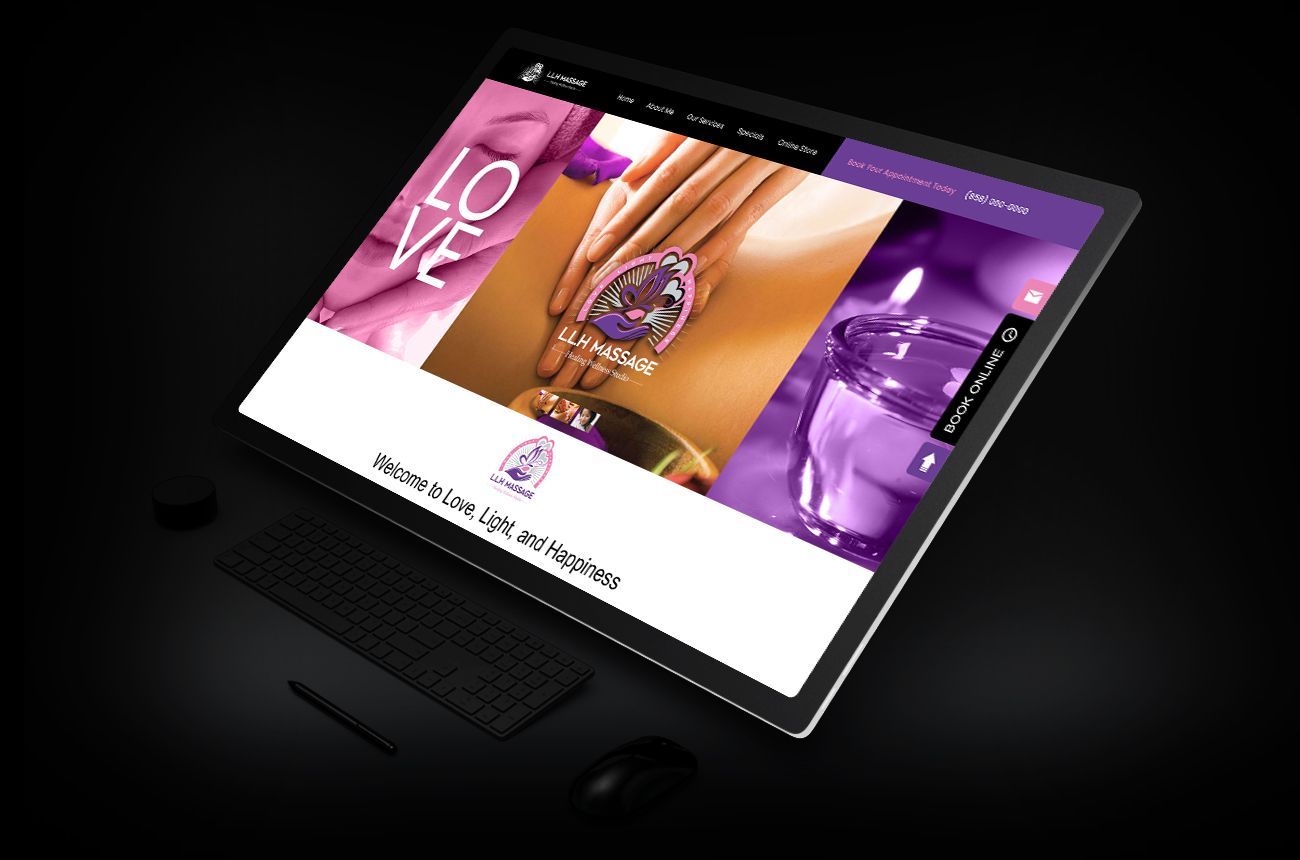
The brand presentation begins here. The viewer is greeted with a vibrant modern design featuring a streamlined sticky navigation and immediate call to action

Core Values

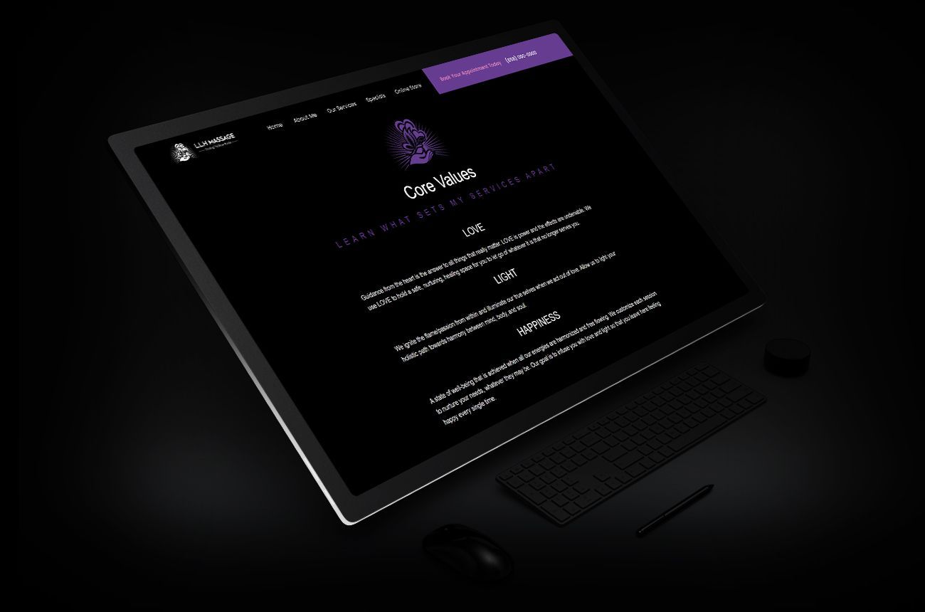
The Core Values section establishes an immediate rapport with the underlying spirit and inspiration of the practice for its viewers.

Scheduling

The site features a full screen contact page with uninterrupted access to a contact form and support CTAs to drive booking.

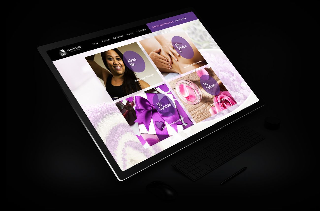
Features

The features section offers access to all aspects of the business including key revenue generators, specials, and policies. Each component is interactive, providing related details and supporting CTAs.

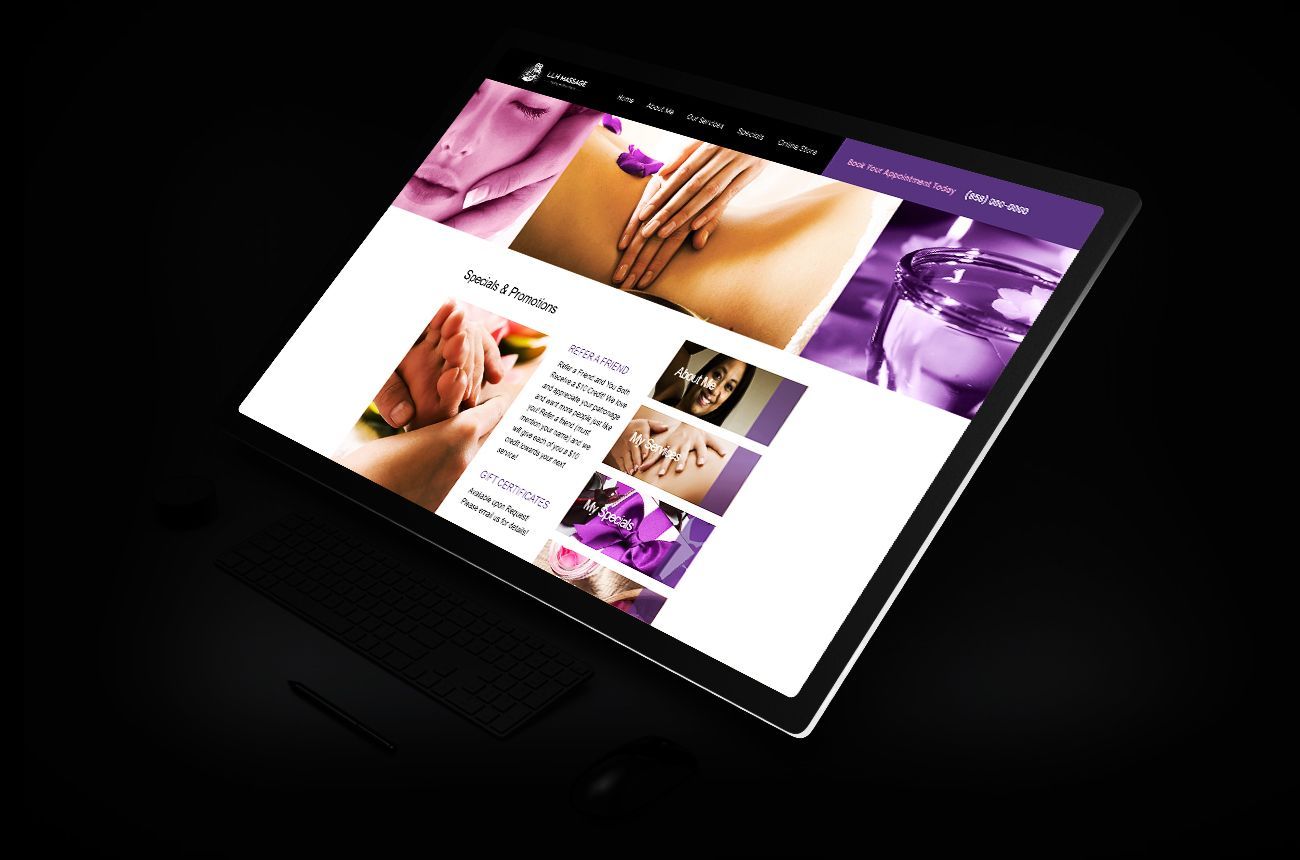
Interior

The interior pages maintain a consistent brand aesthetic and are designed with a content delivery structure that enhances the presentation of detailed content and associated calls to action.


The Process

When entering the massage market, the primary focus was on creating a distinctive logo and color palette to shape the visual identity of the brand. Efforts were concentrated on building a website and executing effective social media campaigns. The new aesthetic was also applied to custom products and promotional materials to enhance the brand's introduction.

Color palette


This is the text area for this paragraph. To change it, simply click here and start typing. Once you've added your content, you can customize its design using different colors, fonts, font sizes and bullets. Just highlight the words you want to stylize and choose from the various options in the text editing bar.

Project Color Palette

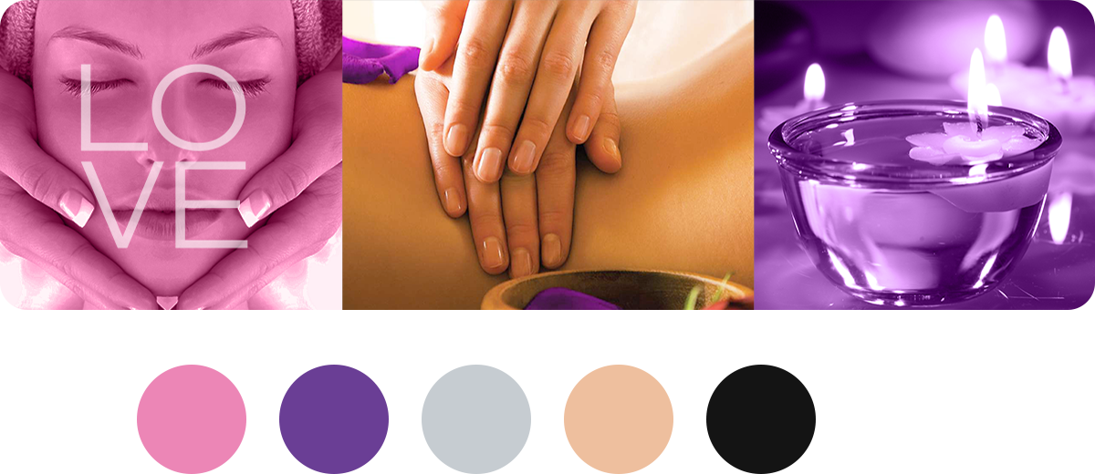
Color palette


A focus on soft, warm, and vibrant energy guided the selection of colors for the palette. The team's preferred soft pink and vibrant purple tones were paired with cool grays and warm accent tones to establish a cohesive overall palette.

Project Color Palette

Add your title here

This is the text area for this paragraph. To change it, simply click and start typing.

Explore

CONCEPTS

Select an image below

to access expanded

detailed examples

BRANDING

Learn more

This is a paragraph. Writing in paragraphs lets visitors find what they are looking for quickly and easily.

This is a paragraph. Writing in paragraphs lets visitors find what they are looking for quickly and easily.

Learn more

This is a paragraph. Writing in paragraphs lets visitors find what they are looking for quickly and easily.

Learn more

This is a paragraph. Writing in paragraphs lets visitors find what they are looking for quickly and easily.

Learn more

Project Results


The company's first three years were a resounding success. Initial engagement efforts exceeded expectations by over 30%, and online efforts generated leads that outpaced projections. Engagement across all targeted demographics saw significant increases, while effective marketing efforts expanded the customer base annually by up to 20%.

Share by: