FLEX


ANNIMATION

TYPOGRAPHY

VIDEO MARKETING


The Process

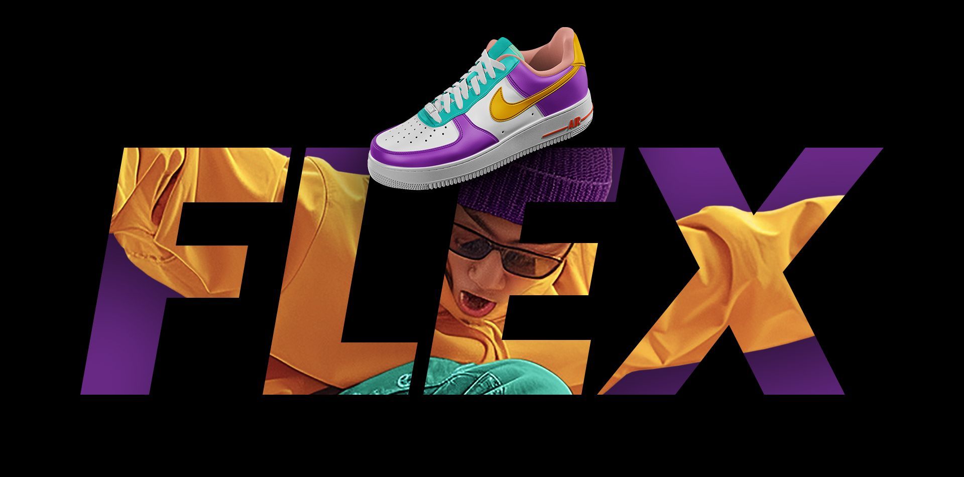
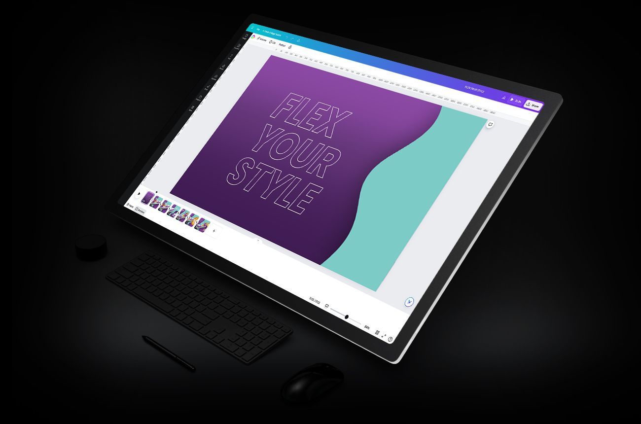
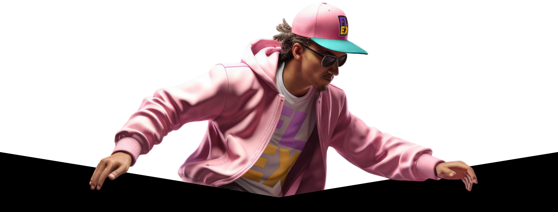
The FLEX branding project demonstrates how a cohesive identity can create a powerful lifestyle brand. The brand voice was carefully crafted to reflect the dynamic high energy vibe of skater and street culture. The brand is adaptable to a variety of skater related lifestyle products as depicted in the various sample images provided below. FLEX employs vibrant colors, bold typography, and energetic motion graphics designed to resonate with the target audience.

Video Intro

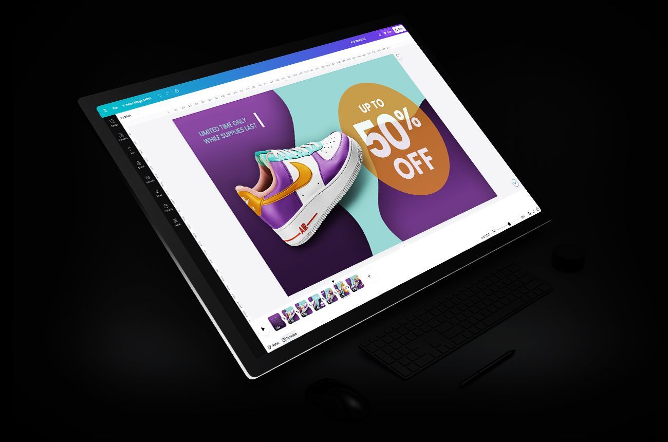
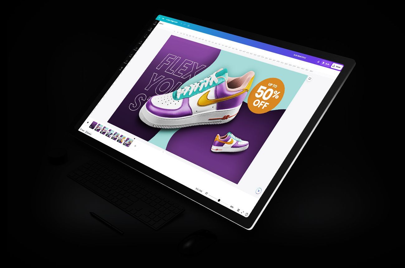
FLEX is an energetic branding exercise that incorporates a spirited sales promotion video highlighting custom sneakers, as part of a lifestyle brand that caters to skater and street culture.

Product

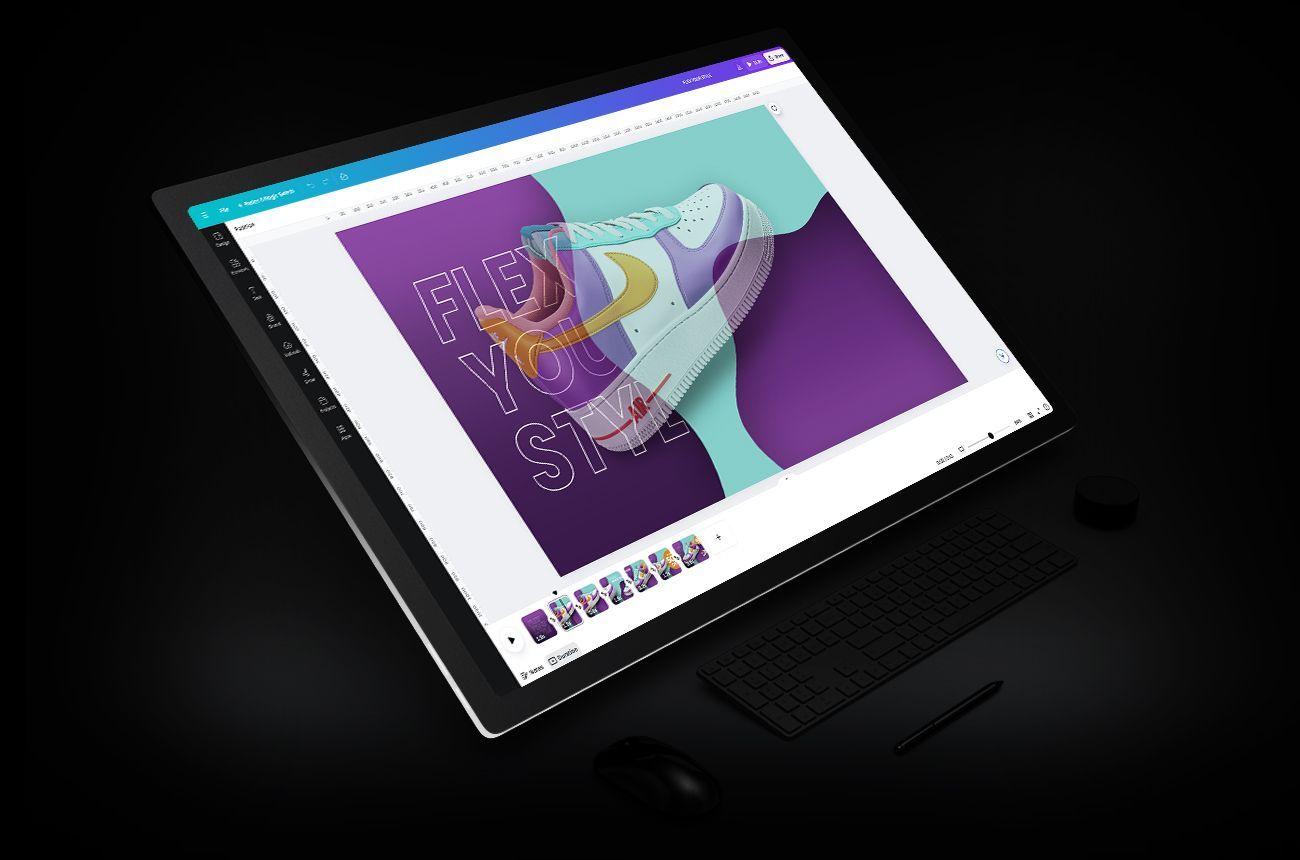
The video transitions from the intro to a hero shot of the lifestyle product creating immediate focus. Curated animation, transitions, and motion graphics accentuate the overall appeal.

Transitions

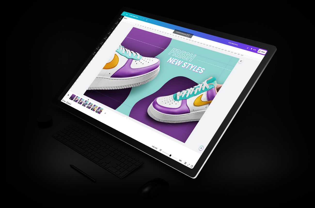
A vibrant energy is expressed through thoughtfully crafted transitions that unite opposing product visuals with impactful animated communications.

Offer

Coordinated graphics paired with contrasting colors present a compelling sales message that swiftly directs attention to the value, while also instilling a sense of scarcity that encourages conversion.

Close

The close completes the message marrying all previously introduced design elements with a strong focus on the product and the value proposition.

Color palette


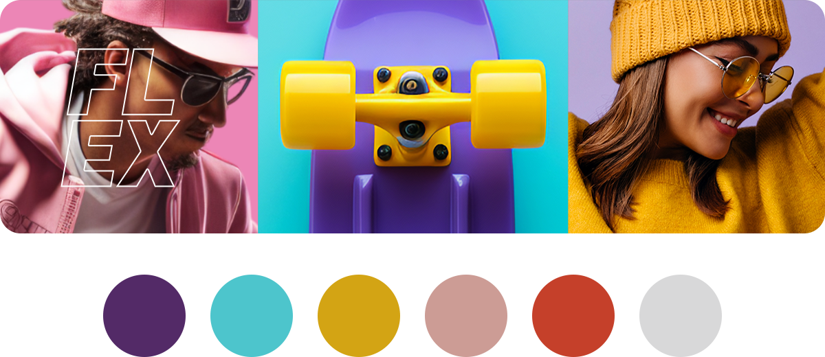
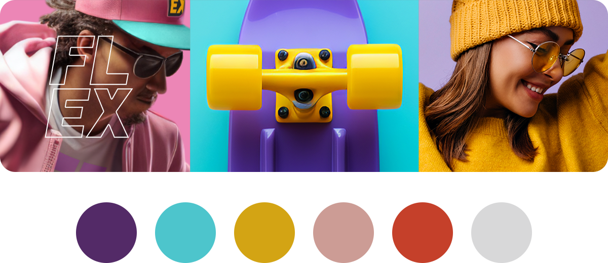
The FLEX branding project features a vibrant color palette of purple, teal, and mustard yellow, each chosen for their dynamic and energetic qualities. The rich purple conveys creativity and sophistication, setting the tone for a brand that is both innovative and premium. Teal adds a refreshing and modern touch, symbolizing growth and clarity, which aligns with our forward-thinking and customer-focused approach. Mustard yellow introduces warmth and optimism, creating an inviting and friendly atmosphere. 

Project Color Palette

Color palette


A focus on soft, warm, and vibrant energy guided the selection of colors for the palette. The team's preferred soft pink and vibrant purple tones were paired with cool grays and warm accent tones to establish a cohesive overall palette.

Project Color Palette

Add your title here

This is the text area for this paragraph. To change it, simply click and start typing.

Explore

CONCEPTS

Select an image below

to access expanded

detailed examples

BRANDING

Learn more

This is a paragraph. Writing in paragraphs lets visitors find what they are looking for quickly and easily.

This is a paragraph. Writing in paragraphs lets visitors find what they are looking for quickly and easily.

Learn more

This is a paragraph. Writing in paragraphs lets visitors find what they are looking for quickly and easily.

Learn more

This is a paragraph. Writing in paragraphs lets visitors find what they are looking for quickly and easily.

Learn more

Project Results


The vibrant high-energy branding exercise for FLEX, with its striking purple, teal, and mustard yellow palette, opens up diverse application possibilities across various platforms and materials. In digital spaces, the dynamic colors can create an engaging and visually appealing online presence, from the website design to social media content. In physical environments, the bold palette can be applied to packaging, signage, and promotional materials, ensuring that FLEX stands out in retail settings and at events. Additionally, this energetic branding can be extended to customer touchpoints like email marketing, mobile apps, and loyalty programs, creating a cohesive and lively brand experience that captures attention and fosters strong emotional connections with the audience.

Share by: